Apple 27-Inch iMac (Late 2013) Review, Haswell Inside
Apple makes some of the best looking monitors around, and the iMac is no exception. A black bezel frames the viewable area, and underneath that is an aluminum strip with Apple's logo sitting dead center. This strip hides the built-in stereo speakers and also houses the integrated 802.11ac Wi-Fi and Bluetooth functionality. The stereo speakers put out a decent amount of volume and are much higher quality that what you'll find in most all-in-one systems, which often sound tinny. It's clear these speakers are here to enhance the experience and aren't included simply as an afterthought.
Up top is the FaceTime HD camera flanked by dual microphones and an ambient light sensor. The dual mics use beam-forming technology for clearer dictation and also to reduce background noise.
 |
 |
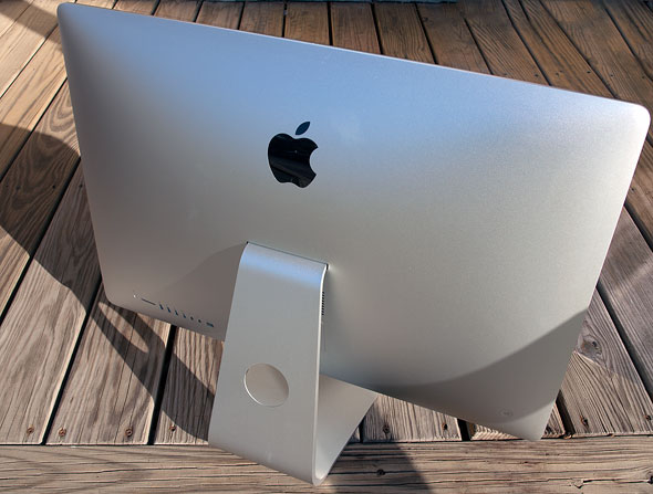
Not everything is peaches and cream, however (or Apple cobbler, if you will). If we're to find fault with the iMac, it would be the stand, which only offers tilt adjustments. You can't raise or lower the display, nor does it pivot or rotate. These aren't deal killers by any means, but they are tradeoffs that are worth mentioning.

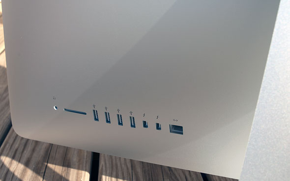
On the bottom left are a series of connectivity options, including a headphone jack, SD card slot, four SuperSpeed USB 3.0 ports, two Thunderbolt ports, and a gigabit Ethernet port. The power cord plugs right into the center of the iMac's backside, and you can route the cable through a circular cutout in the stand.
Aesthetically, Apple made the right decision to banish every single port to the iMac's backside where they're out of sight, but functionally, it's a bit of an inconvenience. How much of an inconvenience depends on how often you plug in external devices like USB thumb drives, especially since the included keyboard doesn't come with any built-in USB ports.


