Should Microsoft Adopt This Slick Windows 10 File Explorer Fluent Design UI Concept?

At some point in the not-too-distant future, Microsoft will roll out an updated version of Windows 10 with its Sun Valley UI overhaul, consisting of a refreshed Start menu and other visual enhancements. It is also working on tweaking File Explorer with its Fluent Design language. Ahead of these changes, however, a teenager posted a nifty File Explorer concept that is garnering lots of praise.
File Explorer concepts are not exactly rare—people are always messing with Microsoft's design and sharing their vision of what it should look like. But we have to admit, this is one of the better visions we have seen, and that seems to be the general consensus.
What exactly is Microsoft's Fluent Design? It is essentially a retooling of the Metro design language that guides the look and feel of Windows 10. Or an updated mold, if you will. Microsoft's aim is to create "adaptive, empathetic, and beautiful user interfaces," with an accompanying experience that "feels intuitive when it behaves the way the user expects it to."
Little by little, Microsoft has been polishing and tweaking bits of Windows 10 with its Fluent Design language. Perhaps it should consider consulting @AlurDesign, who according to his Twitter bio is 15 years old and lives in Poland.
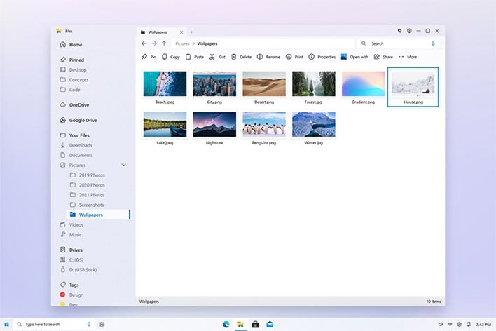
"After more than a month, I finally finished by Fluent Design File Explorer concept! I hope you will like it!," the teen designer wrote.
He incorporated some new icons into the concept (not the ones Microsoft will use, as he began the concept before seeing those), and a feature we'd very much like to see become a reality, that being a tabbed interface. This needs to happen, Microsoft!
We also like how he removed the ribbon interface and plopped everything into the left-hand windows pane/column, complete with folder trees, for easier navigation. The concept images also highlight being able to color code folders (similar to Finder in macOS), which is a nice touch.
The teen design whiz also posted his concept to Reddit, where it currently sit at 1.9K upvotes, with loads of positive feedback.
"Absolutely stunning...I really hope Microsoft starts to care about Windows and puts in the money and effort to make the experience unified and modern.
They need someone with an eye for detail and who cares even for the small inconsistencies," one user wrote.
"Yes. A million times yes. This is beautiful as much as it is functional. Please print this out on a massive piece of foamboard and beat the Windows 10 devs over the head with it until they learn good design," another user wrote.
Make that a million and one times yes, after casting our own vote.
