Hands-On With Plex's Overhauled Mobile Streaming App As A Big Price Hike Looms
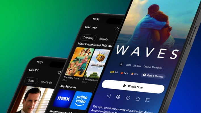
The company says that this new experience aims to “create a global community where everyone can discover, experience, and share all of the entertainment that matters to them.” To achieve these goals the update will supposedly help users better navigate the app and lend itself to discoverability. There will also be a dedicated section for a user’s personal media library, which will be enriched with a more expanded use of artwork. Moreover, there are several features that will make it easier to connect and “share smarter.”
For those who’d rather enjoy content plopped on their couch in front of their TV, this new experience isn’t ready just yet. Plex says it’s app for streaming boxes and smart TV platforms still needs time in its preview program before it makes its way out to users. Unfortunately, no timetable has been given for when these apps will finally be ready to roll out.

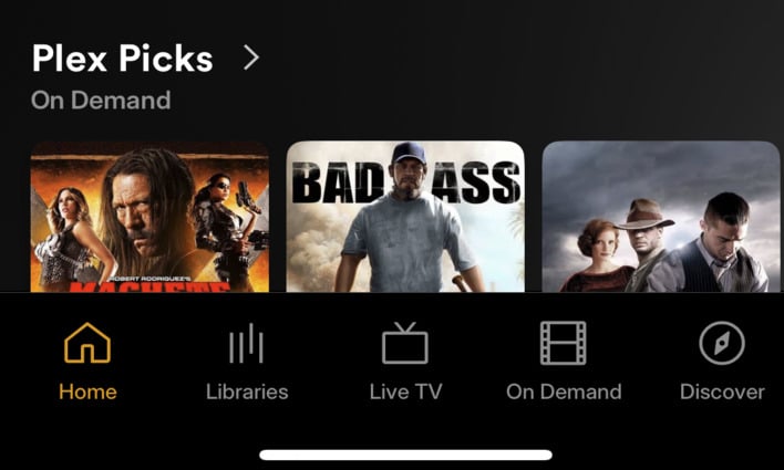
We took the new app for a quick spin on iPhone, and it certainly does put a spotlight on the rich metadata and artwork Plex provides. Although there are things longtime users will need to adjust to. Gone is the sidebar that could be used to move between sections of a media library. Instead, we needed to tap on “Libraries” located in the new navigation bar at the bottom of the screen and then tap on a drop-down menu at the top left of the screen. It’s not very intuitive. Reordering these library sections was also a frustrating experience.
Another issue cropped up while scrolling up and down in any section of the app. There is a very noticeable choppiness that happens when doing this within the app. It’s an unpleasant experience and hopefully something that can be ironed out in future updates.

On the plus side, having the on-demand content, live TV, and discover sections separated out and away from the personal media is a welcomed design choice. It’s there if you want it, but you don’t feel like it’s pushing into your own personal media. However, the Home section will still display items from these other sections beneath the personal media hosted on the server.
The company says that this update will make its way to users through the coming week and asks that users be patient while waiting for their turn to switch over to this new interface.


