Windows 8 Power Struggle: Metro vs Desktop
Conclusion
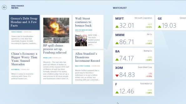
We understand why Microsoft wants everyone to move to the Start Screen. It's a natural reaction when you've spent years working on an interface, particularly given that this new interface will be infinitely better than the old one for a huge number of users. For tablets, Metro is brilliant. In other fields, it's less-than-suitable -- a fact MS has tacitly acknowledged by keeping the desktop prominently integrated in the first place.
 In this case, Redmond really should take a page from Cupertino's book. Apple's MacOS to OS X transition took place in stages; OS X wasn't shipped as the default operating system until it hit version 10.1; Apple maintained the Classic Environment option for running MacOS apps until Leopard hit in 2007. While the parallels are not exact, Apple's slow rollout schedule gave users time to learn the new environment and software developers time to adjust.
Given that Windows supports a software ecosystem that's multiple orders of magnitude larger than Apple's, forcing users to switch back and forth between the Metro Start Screen and everything else makes no sense. There are powerful Windows application vendors like Adobe and Autodesk for whom Metro is a non-starter; there's no practical way to revamp the entire program UI to match Metro's current design.
The best strategy Microsoft could take would be to introduce users to Metro via its included apps and through tablets, while prominently offering the option to maintain the Desktop environment. It literally costs the company nothing -- the desktop environment is already built in. Power users who choose to use the classic UI for desktops and laptops can still be exposed to Metro via tablets and applications without being forced to wade through it on their way to do something important.
This isn't an argument over which interface is "better," it's simply an issue of using the best tool for each task. Metro's Start Screen doesn't meet the needs of power users. Forcing people to change to something different when the superior interface for a particular task is still included in the OS will only breed resentment. Metro deserves a better launch than that.
 In this case, Redmond really should take a page from Cupertino's book. Apple's MacOS to OS X transition took place in stages; OS X wasn't shipped as the default operating system until it hit version 10.1; Apple maintained the Classic Environment option for running MacOS apps until Leopard hit in 2007. While the parallels are not exact, Apple's slow rollout schedule gave users time to learn the new environment and software developers time to adjust.
 Given that Windows supports a software ecosystem that's multiple orders of magnitude larger than Apple's, forcing users to switch back and forth between the Metro Start Screen and everything else makes no sense. There are powerful Windows application vendors like Adobe and Autodesk for whom Metro is a non-starter; there's no practical way to revamp the entire program UI to match Metro's current design.
The best strategy Microsoft could take would be to introduce users to Metro via its included apps and through tablets, while prominently offering the option to maintain the Desktop environment. It literally costs the company nothing -- the desktop environment is already built in. Power users who choose to use the classic UI for desktops and laptops can still be exposed to Metro via tablets and applications without being forced to wade through it on their way to do something important.
This isn't an argument over which interface is "better," it's simply an issue of using the best tool for each task. Metro's Start Screen doesn't meet the needs of power users. Forcing people to change to something different when the superior interface for a particular task is still included in the OS will only breed resentment. Metro deserves a better launch than that.


