Yahoo! Introduces Revamped, Modern Logo as Company Evolution Continues
Well, if you're going to kick off 30 days of change, you might as well waste no time in getting right to the crux of things. Yahoo, after a solid year of acquiring companies left, right, and center, is kicking off a new campaign that'll spur a massive amount of change in an Internet company that has seemingly grown stale with time. Right away, the company is getting rid of something that has defined it for years: its logo.

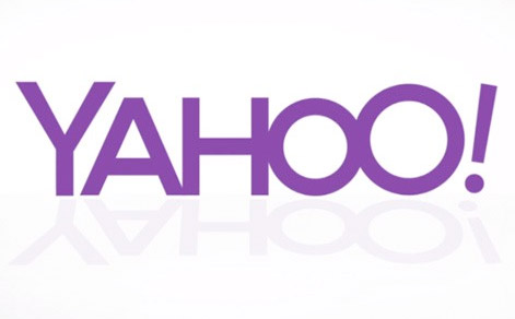
The new Yahoo logo is seen here, boasting more modern text, a bolder and less childish font, and the same "!" at the end. Some things can change, but clearly, the exclaimation point at the end had to stay put. Kathy Savitt, the company's CMO, states that the logo is evolving right alongside "the essence of our brand." Indeed, Yahoo has innovated and evolved rapidly, and here's the company's take on the new image:
So, what do you think of the new logo? (And will that famed San Francisco billboard have to be taken down now?!)

The new Yahoo logo is seen here, boasting more modern text, a bolder and less childish font, and the same "!" at the end. Some things can change, but clearly, the exclaimation point at the end had to stay put. Kathy Savitt, the company's CMO, states that the logo is evolving right alongside "the essence of our brand." Indeed, Yahoo has innovated and evolved rapidly, and here's the company's take on the new image:
"The new logo will be a modern redesign that’s more reflective of our reimagined design and new experiences. To get everyone warmed up, we are kicking off 30 days of change. Beginning now, we will display a variation of the logo on our homepage and throughout our network in the U.S. for the next month. It’s our way of having some fun while honoring the legacy of our present logo."
So, what do you think of the new logo? (And will that famed San Francisco billboard have to be taken down now?!)

